
2024 Colour Theory: Earth, Wind & Fire
2024 Colour Theory: Earth, Wind & Fire
Ultimo aggiornamento 8 gennaio
Data di creazione 13 ottobre
What colour trends will we see in 2024? This year, it's all about embracing the elements of Earth, Wind & Fire.
Each year colour trends emerge that perfectly capture how we’re all feeling. Reflective of everything from the political landscape to developments in technology, these colours help us navigate the year and feel rooted in our lives - allowing us to embrace, or counteract, the outside world and create our very own sanctuary within it.
Want to feel rejuvenated and ready to take on the world via your wardrobe? Maybe you’re looking to instil calm in your life and find a place to switch off at home? Colour theory can help with that. What colour trends will we see in 2024? It’s all about embracing the elements. Read on to discover the many shades and tones of the year ahead.
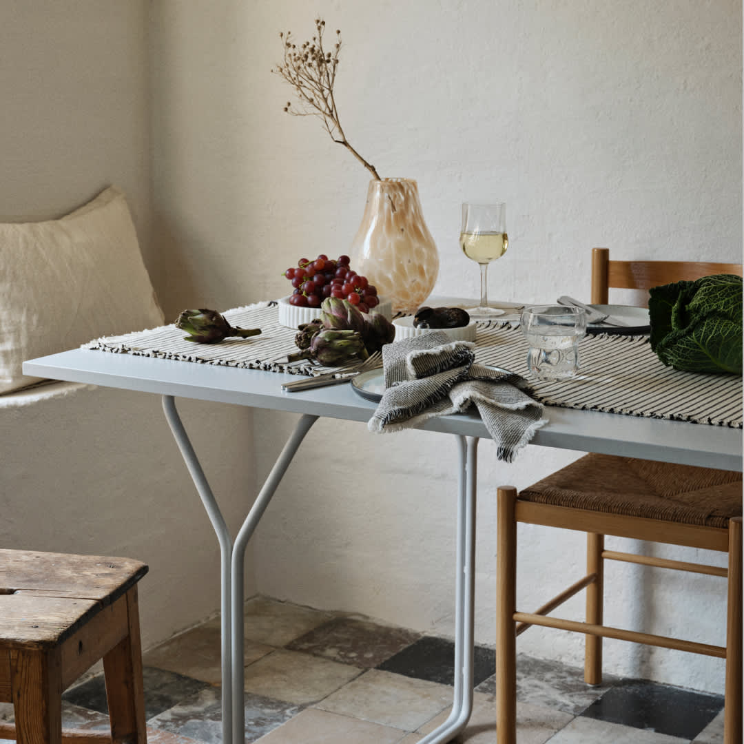
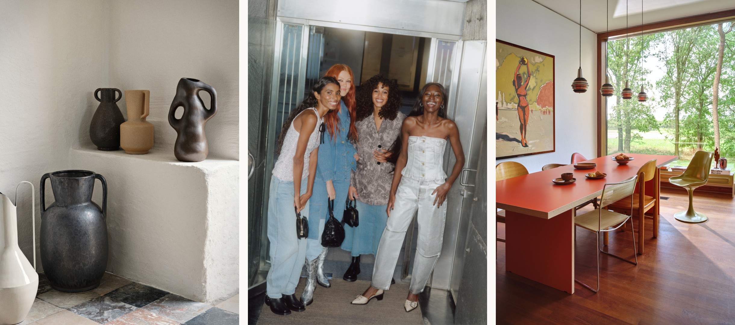
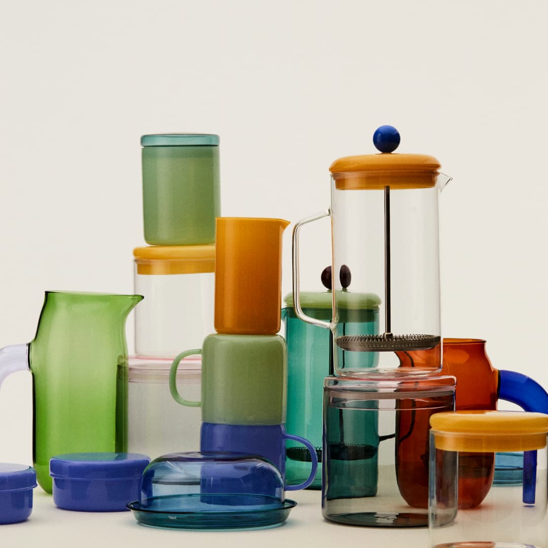
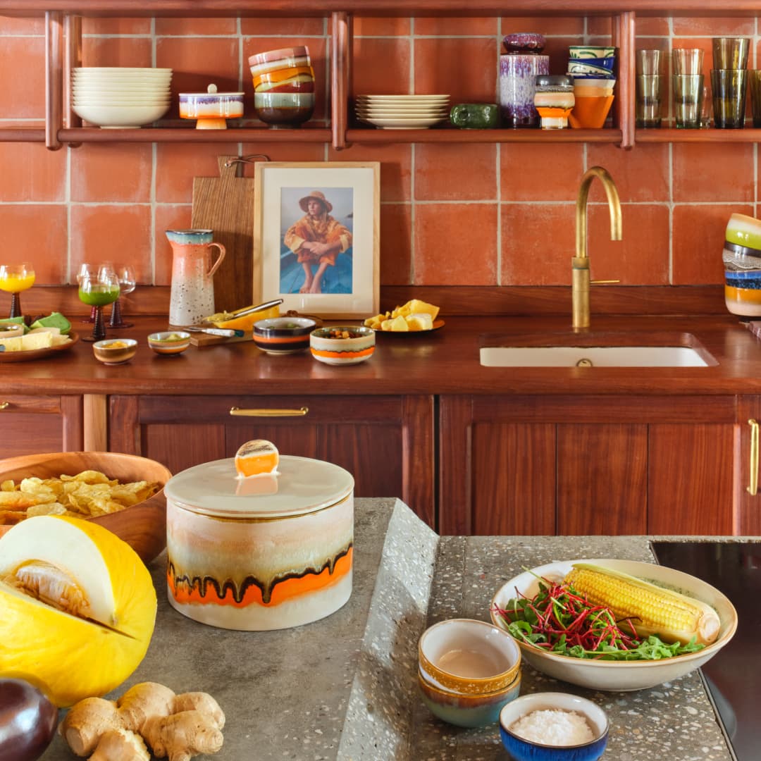
Earth
Get grounded and find your centre. With the rise in popularity of rituals such as earthing, saging and meditation, it’s only fair that this natural and considered approach to life filters into our home and wardrobe choices, too. Earthy tones and textures (and earth friendly materials) are set to take over this year, and help us feel rooted and happier. Embrace the natural world with earthenware clays and woods to bring a sense of calm in the home, or untreated natural fibres and traditional manufacturing techniques in clothing choices. For the home, look to HKliving’s slub cotton cushions and molten glaze 70s ceramics. For you, we’re loving Soeur’s celtic-inspired knits and plaid gilets.


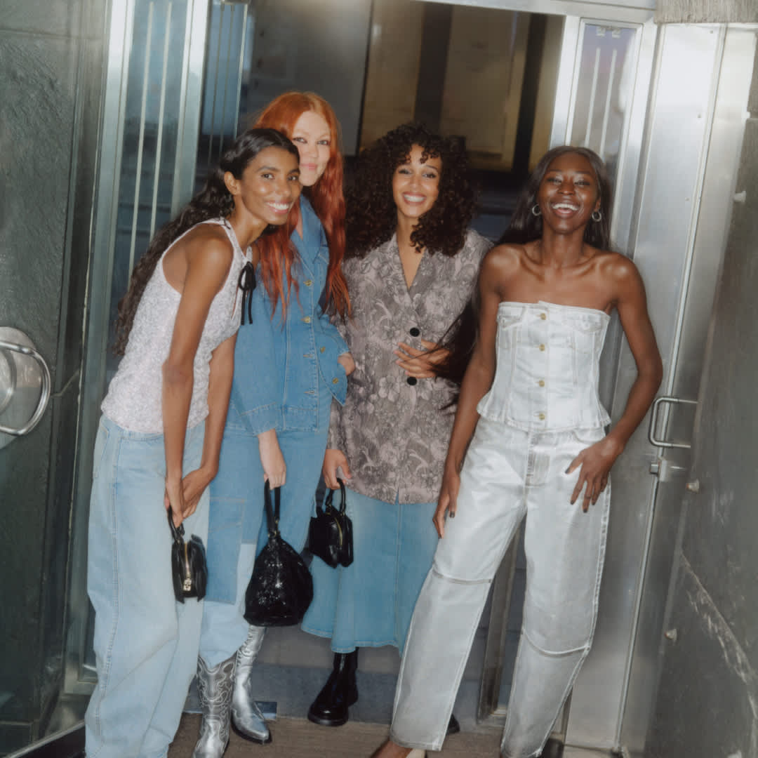
Wind
Feel as light as air with uplifting blues. Known for evoking a feeling of calm and stability, paler, icy blue are a great choice for bathrooms and bedrooms to instil a sense of tranquillity and relaxation. Go for pale blue bedding and textiles over paint colours if not wanting to fully commit. Broste Copenhagen’s Stripe cushions are top of our list. In our wardrobes, lighter sky blues are set to take over the high street, and contemporary brands alike. Scandi-favourite Stine Goya has opted for dip dyed denim styles, while Ganni’s signature shapes have taken on an ethereal quality with fuzzy floral prints and soft focus cloud-like space dyes. Head amongst the clouds? Yes please.


Fire
Bask in the glow of warm oranges and peaches. From Pantone’s Colour of the Year, Peach Fuzz to WGSN’s Apricot Crush, warm peachy tones are on their way this year. Reminiscent of sunsets and basking in the glow of a warmer climate, these orangey hues are escapist, and the perfect colour to add a touch of the Mediterranean to your home, and create a sanctuary. Our take? Go tonal and embrace rich terracottas - check out Madam Stoltz’s rustic vases - and deeper rust oranges as well as the brighter tones for a more subtle way into the trend.


