

The Psychology of Colour
Last updated February 16
Date created October 13
Colour is so much more than a trending shade, a decorative hue to dabble in because the zeitgeist said so. From calm to cosy, colour can transform the feeling of a space, and in our wardrobe has the ability to boost our mood and bolster our confidence. Colour often reflects the global mood, too: in a political and economic downturn? Society often leans towards bright colours as the perfect antidote to austerity - just look at the trending colours of 2023, all and bold shades of lilac and green..
Choosing the right colours for your home or outfit can instantly make us feel safer, revitalised, focused or even calmer.
Whether overhauling your room with new home decor or looking to give your wardrobe a rainbow refresh - you can use colour psychology throughout your home no matter what space, time, budget or even effort you can muster.
Read on as we take you through our easy guide to the transformative power of colour psychology, and how you can adopt it in your home.

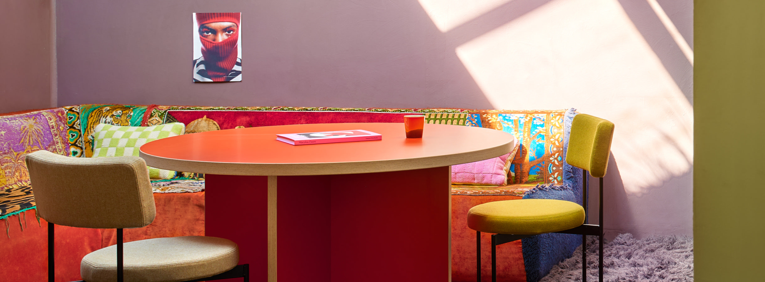
Shades of red and pink are perfect for adding warmth to a room thanks to the rosy glow they bounce around a space. Growing ever popular are pink bathrooms, and it’s no wonder. An instant warming, cocoon-like effect to the room - perfect for sinking into a little R&R, instantly making us feel like our best selves. Sign us up.
In fashion - with its connotations of power, passion and confidence - red is the ultimate power dressing colour. Make a statement and feel emboldened whether on a date, going for a job interview, or even just grocery shopping. Check out SamsoeSamsoe’s SS23 collection for bold red shades across summer dresses, tailored trousers, and shirts to take you from boardroom to bar.
Blue is an old reliable in clothing - from blue denim to traditional workwear twills, blue has been a go-to for centuries, imbuing the colour with a timeless quality you can feel confident in. For the home, blue can create a calming sanctuary. Known for its connotations of hope and peace, blue is perfect for encouraging sleep in a bedroom, or calming connection in communal spaces. For the bedroom, try bedding in pastel hues, and accent cushions in darker tonal contrasts to create depth. We love Ib Laursen’s delicate blue florals to add a romantic touch around springtime.
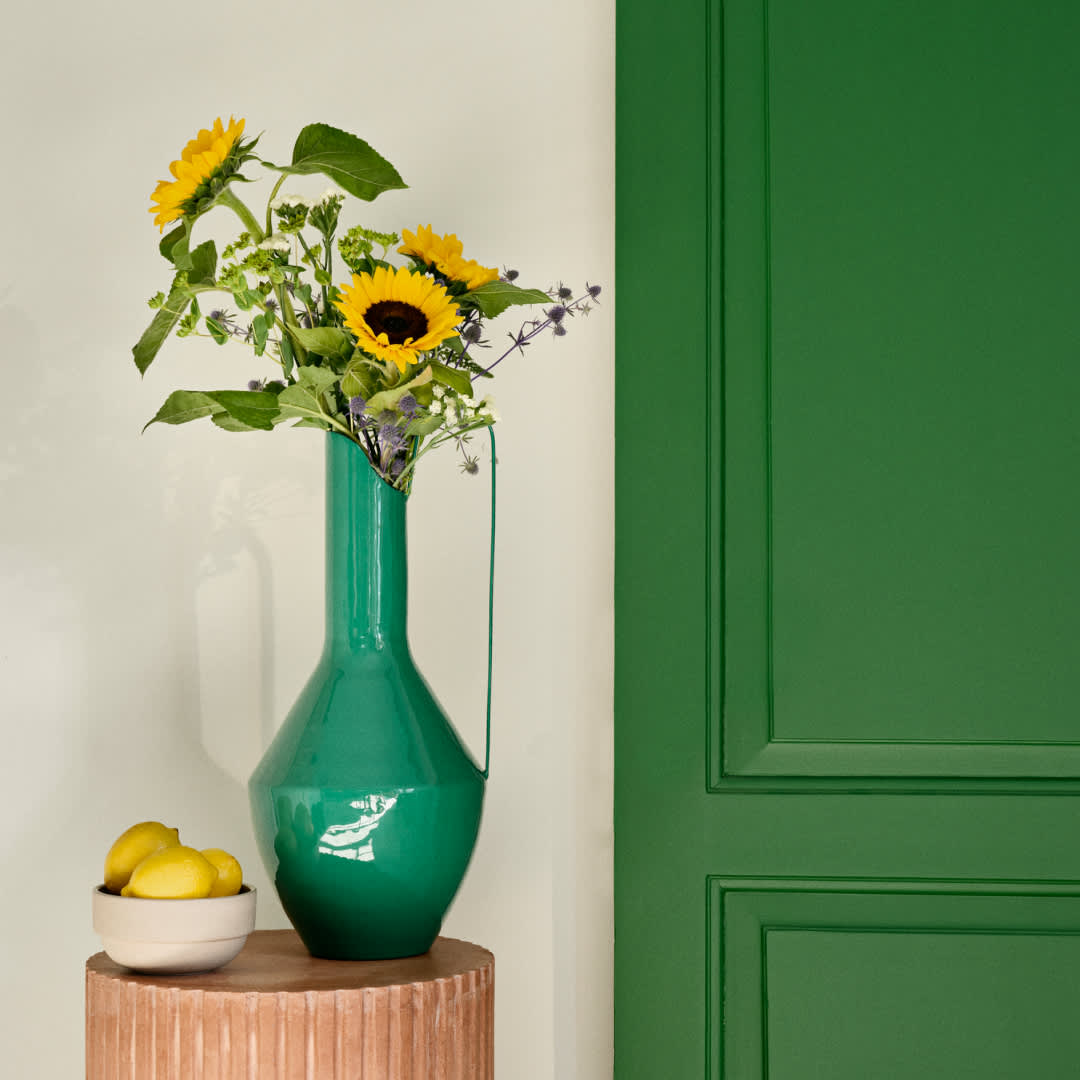
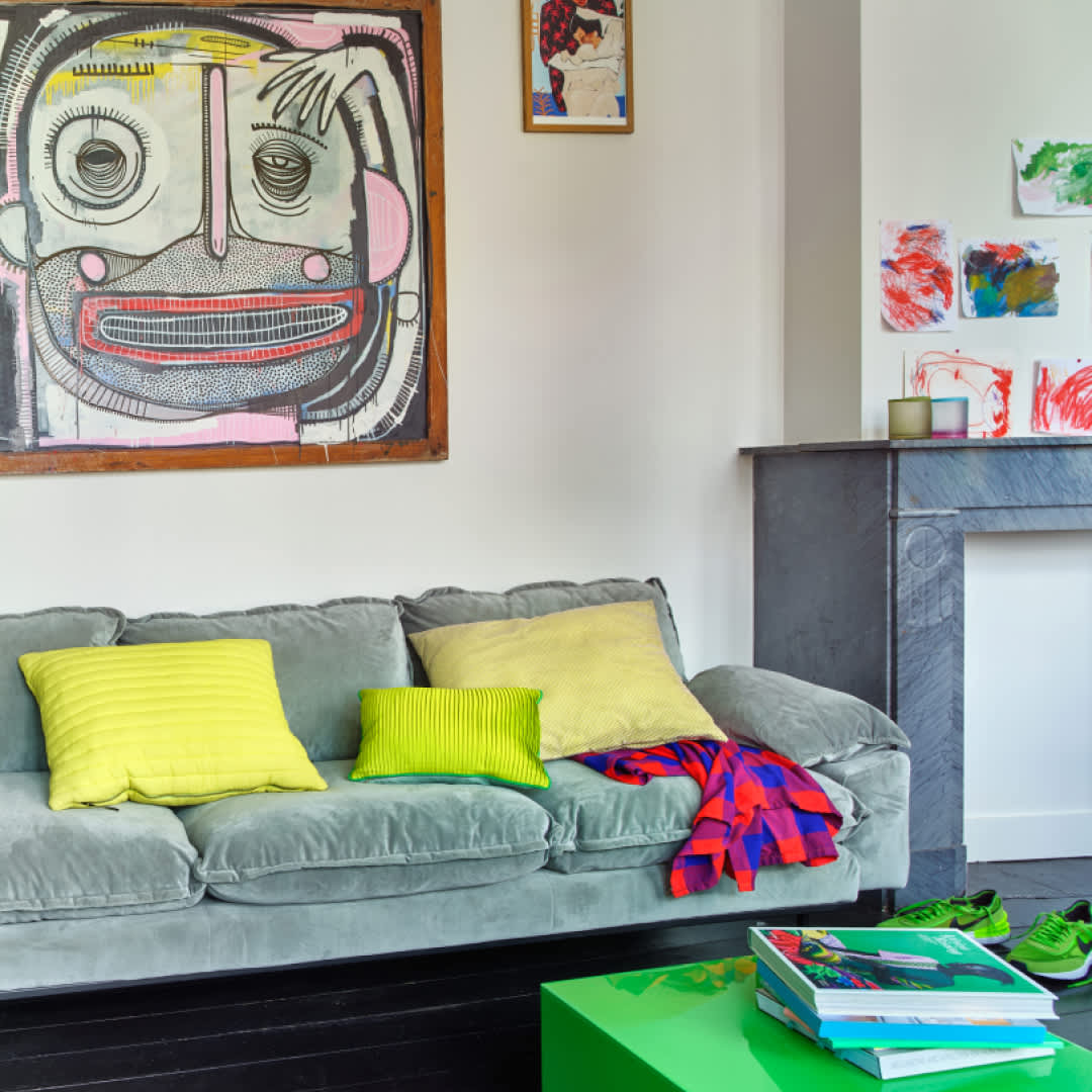
Bring the outside in by adding green to your space. Thanks to Mother Nature, green is known for grounding and calming us, making it perfect for any room in the house. Try green the bathroom to create a tranquil space - think towels and textural accents such as Bongusta’s tonal stripes - or add green into the living room to make for an inviting space for you and your guests. Try cushions, throws, and curtains to create a rich, layered look, ceramics such as candle holders or vases to bring the outside in, opt for the real thing with houseplants, or spruce up the garden for the view from your windows. Check out south London-based boutique Forest for plants of all varieties, or Waltons of Yorkshire for oh-so-soft blankets ready to curl up in.
Add beiges and neutral colours to bolder colour schemes to create balance. Neutral spaces act as a blank canvas both literally and emotionally, meaning we have more space to breathe and reflect. Instead of opting for lots of colour, try out layering different materials and textures in neutral tones. Take a masterclass in neutrals from Madam Stoltz to find your calm. A beige lamp on a wooden sideboard within a rich colour scheme can act as a natural resting place for the eye to avoid an overwhelm of the senses.


